Custom colours
People have been all over me for the colours in the charts ever since I made them a little more prominent. Somehow I never managed to get the colours right for everyone.
So finally here’s the solution to end this conversations for good.
Custom Colors for the 3 colors I use in charts. Pick and chose to your hearts delight.
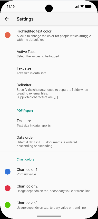
The way these 3 colours are applied is like follows:
- For BloodPressure I use the 3 colors for Systolic, Diastolic and Pulse. The respective trendlines use the same colours but different line types. “…” for linear trendline and “- - -” for the moving average.
- Tabs with just one value use colour 1 for the value and colour 2 and 3 for the trendlines.
Whilst on it I also added this colour picker for the highlighted values setting.
Click here to get to the pre-release. Give it a spin and let me know if you find something not working as expected.